Via Flickr:
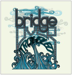
Think I'm done. So this was a personal project. I am a fan of Simon and Garfunkel. Oddly enough this isn't a favorite song, I just like the way it flows and this is the image that popped into my head. I gave myself a few guidelines to adhere to when starting this project. I wanted to minimize my color palette. Use about 5 colors in various shades and use the tools within the program to manipulate and get more variation. And I wanted to use my own lettering, no fonts. I may tweak the colors but I am overall happy with the final product.


No comments:
Post a Comment